Volume II, Issue 1
Our second year starts off with four fantastic projects. The first two projects in this issue focus on concepts of creating a perception of our surroundings through visual and auditory inputs. Each presents a novel manner to visualize a landscape and sound-based mapping—one with the scale of New York City and another to a community festival. While diverse in methods and scales, these projects offer a unique view into spatial mapping.
Our third project is a fun and interactive way of visualizing political dialogue (utilizing speeches from the 110th United States Congress) with a set of animations similar to the popular JibJab cartoons. Our fourth project is a somber yet beautiful art and visualization installation discussing the effects of war. Together, these two pieces discuss the simultaneous power and fragility of individuals and words within larger dialogues.
Brian Willison, Publisher
Parsons Journal for Information Mapping

Pastiche—A Collective Composition of New York City
by Ivan Safrin & Christian Marc Schmidt, MFA
Ordnance Survey: Exploring Activity through Large Scale Topologies and Auditory Mappings
by Dr. Tom Davis, PhD & Nicholas Ward, MSc

Congress Speaks
by Dino Citraro, BA & Kim Rees, BA
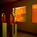
Requiem
by Sayoko Yoshida, MFA