Volume VII, Issue 1
On one hand, the meta-language for visualization is ever being refined—for this reason PJIM is always considering taxonomy and ontology that enable improved knowledge-tool building. To that end we’ve presented a paper dealing specifically with node-and-link visualization. On the other hand? Experimentation.
With the growth and attention lavished on data visualization and information design comes the natural fallout of aesthetics for its own sake. This really takes on two forms: experimentation with technical programs and processes yielding unexpected visual outcomes; and models crafted with a bias of achieving compelling, and attractive, visual results (at the short term expense of clarity). This, despite the (professional) basis of our endeavors respecting information visualization and (as we all agree…) the aim toward that greater good of clarity, simplicity, and effective conveyance of information—be it basic instruction, patterned knowledge, or emerging intelligence.
In many of these cases the objective is in making formerly qualitative data realized through a more quantifiable way. Herein lies the opportunity: What if a “front-loaded” aesthetic and experimental approach yields the desired outcomes though the technique is unorthodox? In this spirit of the counter-intuitive, we offer two articles that deal with the “mapping of storytelling”—specifically the kinds of non storytelling that is increasingly part of the film and movie industry, where digitization and data manipulation allow for richly interwoven counter-sequential renderings.
Alternatively, is an article dealing with exceptions and anomalies, what are sometimes called, "Anomolytics." These types of media are where storytelling and big data meet. Consequently, experiments and applied graphics of this type will allow us to find answers from nature and human social structures where stories also overlap, or do not, at first glance, follow logical sequence. A case where art cannot only imitate life, but derive more knowledge from the complexities and milieu of human life.
Jihoon Kang, Publisher, and William Bevington, Editor-in-Chief
Parsons Journal for Information Mapping
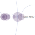
Using Interactive Data Visualization to Explore Non-Linear Movie Narrative
by Rasagy Sharma & Venkatesh Rajamanickam
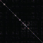
Gaining Insight Into Films via Topic Modeling & Visualization
by Misha Rabinovich, MFA & Yogesh Girdhar, PhD
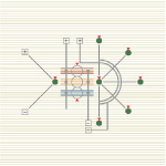
Taxonomic Considerations for Node-and-Link Visualizations
by William M. Bevington