Volume IV, Issue 4

With this issue of PJIM we complete our fourth volume, and our sixty-third article. The feedback we've received from our articles and our new website are greatly appreciated. We continue our efforts toward making our articles more comprehensively cross-related and searchable. For this issue we are pleased to present three articles that deal with information design and the process of designing.

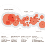
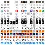
For this season’s issue of PJIM we look at an installation that evaluates information design practice with the aim of “providing a systematic view on the discipline.” By considering the origins, impact, and democratization of the field the author looks to possible future trends. The investigation is, in itself, a piece of information design that compellingly integrates the viewpoints with with physical examples. Following the idea of trends and of particular interest to graphic and symbol designers is our next article dealing with Olympic Games pictographs. Few human endeavors have amassed such a collection of symbols created for one event. Today, nearly five hundred symbols have been designed for the Olympic games. The author, through a series of interviews, discussed how the symbols were brought together, analyzed, and scored in order to create diagrams that compared 66 years of pictographic design contextually.

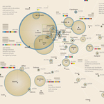
Another major trend in design is the integration of visual language Journalism with Information graphics and information design. If one considers pure textual transmission with headlines as the only graphic call-outs, to text and image and text and diagram, to today's integrated displays of richly supported text this trend is apparent. Will the process evolve to the point where the information design composite is the entirety of the article. Our last contributors lays out the architectonics of creating info-journalism. The text is supported by sublime and aesthetically rich examples of textually rich diagrams that are published as a major feature within a weekly supplement. The trends and methods for the craft of Information Design are expanding rapidly we are pleased to capture some of the insights dealing with the field in the issue.

Jihoon Kang, Publisher, and William Bevington, Editor-in-Chief

Parsons Journal for Information Mapping

The Diagram of Information Visualization

by Gaia Scagnetti, PhD

Trends in Olympic Pictograph Design: A comparative study using Olympic Games’ Sports Symbols

by SoJung Kim

Non-linear Storytelling: Journalism through “Info-spatial” Compositions

by Giorgia Lupi, M.Arch, BFA

The Diagram of Information Visualization

by Gaia Scagnetti, PhD

KEYWORDS

Communication design, design research, diagram, exhibition, history, information visualization, interactive piece, tool, 3D

ABSTRACT

In the last ten years the area of Information Visualization has witnessed an exponential increase in its popularity. Diagrammatic reasoning and visual epistemology are becoming readily accepted methods of research in many academic domains. Concurrently, information graphics and Infovis have grabbed the attention of a larger mainstream audience.

This project communicates the history and development of Information Visualization discipline through an educational piece the audience can physically interact with. The visualized data are the results of an empirical work—the case study of 30 design projects developed in Information Visualization between 2005 and 2011—conducted in collaboration with the Austrian Institute of Technology. The resulting diagram has been transformed in an interactive three dimensional piece as part of an exhibition on diagrammatic reasoning.

The piece shows the story of Information Visualization, from past to future. It traces its expansion and features the projects that have had great influence on the discipline. It suggests potential directions where this field may develop in the near future. In the piece, each tin represents a project that participated in the development of Information Visualization. Each tin contains a description of the project, author, data, and a QR code linking the project website. The red circles diameters indicate the relative impact each project had on the field of Information Visualization. The right wall shows the subjects and disciplines where Information Visualization will have great influence in the future. Projects are grouped by subject and distributed chronologically within the groups.

BIOGRAPHY

Dr. Gaia Scagnetti is an expert in visual epistemology for decision making and strategic planning as well as information visualization and mapping. Her current research investigates the impact of Information Visualization on design discourse with a focus on design education. Her complete portfolio at namedgaia.com

Trends in Olympic Pictograph Design: A comparative study using Olympic Games’ Sports Symbols

by SoJung Kim

KEYWORDS

Berlin olympics, identification design, London olympics, olympic pictograms, olympic pictographs, olympic symbols, sports symbols

ABSTRACT

Sixteen unified symbols were designed for the 1936 Berlin Olympics. From that initial series of pictographs, until the latest 2012 London Olympics, approximately 500 pictographs and pictograms have been designed to represent the various summer and winter sports included in the Olympic Contests. These pictographs and pictograms vary in design from figuratively realistic in form to highly interpretative. In a somewhat parallel way they range in design from ostensibly “detailed,” or complex to pointedly reductionist. These two vectors: Realistic vs. Interpretative; and, Complex vs. Reductionist allowed the Olympic symbols to be comparatively plotted. For the two demonstrations included in this paper, only one series, those used for hockey, both hockey and ice hockey, are investigated. I used the hockey symbol because it is the most prevalent through modern Olympic history and it is the only sport that is present in both summer and winter Olympics, from 1936 to present. (Only one series of symbols need be used for the plotting because any particular year’s set of symbols maintains a consistent look respecting realistic/interpretive and complex/reductionist factors. Therefore, a similar relationship would exist for any one plot to every plot of symbol types: hockey, cycling, swimming, etc.) The goal was to ascertain trends on the design of Olympic pictographs and pictograms. To understand and reveal this, a score for each symbol needed to be developed and this score needed to then be plotted over time. The score was to be determined by the initial scatterplot that would set the “range of design.” For the first diagram, the scores for the two factor-comparatives are plotted, revealing the range of design approach relative to each pictogram. For the second diagram, the scores from the first are combined. The symbols are then presented in a chronological diagram. This diagram serves to reveal design trends, or lack thereof, across the full range of Olympic pictographs and pictograms. In order to provide the full context to this work a nearly total collection of every symbol, from 1936 to present, is provided.

BIOGRAPHY

SoJung Kim is currently a Communication Design student within Parsons The New School for Design, this project is part of her research and working thesis toward the creation of representative Olympic pictographs for the full complement of both summer and winter sports.

Non-linear Storytelling: Journalism through “Info-spatial” Compositions

by Giorgia Lupi, M.Arch, BFA

KEYWORDS

Data visualization, design procedure, information architecture, information hierarchies, non-linear story telling, spatial composition

ABSTRACT

Information Design is playing an increasingly critical role in everyday journalism. The movement from word and picture to “words within diagrams” is building a new form of truth telling and storytelling—and with it, a new journalistic aesthetic. This article, “Non-linear Storytelling: Journalism through Spatial Compositions” presents a series of controlled case studies for the “column” entitled “Visual Data” that appears on a weekly basis within the Italian newspaper Corriere della Sera. “Visual Data” is published every week within La Lettura, the Sunday cultural supplement within Corriere della Sera.

A fundamental shift in how text is “supported” distinguishes the Visual Data column from others within the publication. The traditional aesthetic of pictures coupled with text is instead interpreted through revealing, diagrammatically, the underlying “data” itself. In the traditional instance pictures or images (which may be said to be spatial in nature) are captioned or elucidated through text. In the examples presented under Visual Data the arrangement is “info-spatial.” Text still plays a critical role, but it is nearly always in identification, captioning, or labeling roles; it is the last mile of the cognitive equation.

The end results: the info-spatial diagram supported by the traditional approach of photojournalist and reporter versus the info-spatial non-linear storytelling requires a different approach to content building. Aspects of aesthetics—whether these be visually compelling through “emotive beauty” or “functional beauty” are requirements for either approach. However, the “beauties” of powerful photography and writing within traditional great journalism are matched are to be compared to a new kind of “structural beauty” and “intellectual beauty” for data visualization. Again, the approach to creating effective outcomes requires a different kind constructor. If we are to catch, and retain readers’ attention the goal must be to create “layers” (the visual and textual composition) as opposed to “lines” (the linear composition).

Our design method, based upon layering multiple sub-narratives over a main construct prescribes this specific phenomena: the intelligent constructs that lead to info-spatial journalism. How might a team (oftentimes information design is a team endeavor) approach this process? This is of particular concern if a information diagram might be required on a regular publishing schedule. If such new forms of journalism become not merely supplementive of the older models (as is the case with information graphics supporting articles in lieu of images and illustrations) but instead the articles themselves (where the text plays the subservient role) what kind of protocols can ensure reliable generation of examples? The paper outlines the process through a general description of the layering idea and the spatial build-up of the visualizations. It goes into some depth describing a selection of examples and touches upon our data analysis and concept building toward the practice of journalism for info-spatial composition: non-linear storytelling.

BIOGRAPHY

Giorgia Lupi is an architect, designer, and researcher. After graduating in Architecture at Ferrara University in 2006 she has been involved in multidisciplinary projects exploring urban phenomena, information and technology. Ms. Lupi is a PhD candidate at Milan Politecnico, Design Department, within DensityDesign Lab; her PhD research aims at designing new methods for interpreting urban phenomena through digital traces. (giorgialupi.net) Currently, Giorgia is a visiting scholar at Parsons Institute for Information Mapping in New York. In may 2011 she founded the design company Accurat. This allowed he to build working partnerships upon past professional with Simone Quadri and Gabriele Rossi.