Volume III, Issue 2
In this Issue of PJIM we explore how visualization serves as a critical aid in strategizing responses and formulating insight respecting the contextual rendering of the content we have before us. A fourth article cautions against relying on paradigms of usage that have become standardized through traditional, or “first-practiced” approaches, when opportunities for more effective usage (though non-user standard) might be more advantageously pursued. The notion of “touchpoints,” a term with ever-increasing application for both business-to-consumer and government-to-citizen considerations, serves to connect our four articles. In areas as socially decisive as evacuation preparedness; as crucial as disease monitoring; as business-critical as consumer/customer diagramming; and, as promising as improving user workflow, a better understanding of, and visualization of, touchpoints provides efficiencies of scale significant in our information age.
Brian Willison, Publisher, and William Bevington, Editor-in-Chief
Parsons Journal for Information Mapping
Pushing the Interface: Questioning Existing Web Interaction Models
by Aidan Rowe, MRes
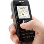
Design for Evacuation: Improving City Evacuation Instructions
by Claudine Jaenichen, BFA
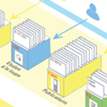
Locating Value with Alignment Diagrams
by James Kalbach, MA, & Paul Kahn, BA
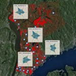
Data Visualization and Interface Design for Public Health Analysis: The American Hotspots Project
by Jihoon Kang, MFA