Volume II, Issue 4

For the concluding issue of PJIM’s second year we have touched upon four areas relevant to the analysis, the benefit, the practice, and even the enjoyment of information design. The first article investigates Islamic religious symbolism in respect to embedded meanings and expected user response, particularly how symbols have such significance to their targeted users. From here we discuss how contemporary information design practice may be compared to conventions within a particular field—in this case lighting design. Our third article returns to basics: the ever challenging search for a theoretical step-by-step process to successful visualization design. Our final article is a direct challenge to high-tech geospatial mapping; the author presents a highly subjective interpretive mapping of the ocean coast through recording the “voice” of the ocean. Enjoy.

Brian Willison, Publisher, and William Bevington, Editor-in-Chief

Parsons Journal for Information Mapping
Visualization of Islamic Religious Symbolism on the Internet: A Conceptual Blending

by Veronika Tzankova & Thecla Schiphorst, PhD
Drawing Light: a Graphical Investigation of Light, Space and Time in Lighting Design

by Nathalie Rozot, BTS & Antonia Peón-Veiga, MFA
Visual Representation for Viewpoints, Concepts, and Persuasiveness

by Tingyi S. Lin, MFA, PhD
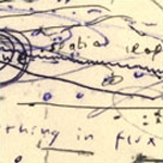
Mapping Ocean Dynamics

by Peter Matthews, MFA

Visualization of Islamic Religious Symbolism on the Internet: A Conceptual Blending

by Veronika Tzankova & Thecla Schiphorst, PhD

KEYWORDS

Interface design, Islam, morality in interaction, religious symbolization, sociology of Islamic representations, visual religious representation

ABSTRACT

An exploration of the conceptual blending of religion in its visual representation on the internet begins with the recognition of religion as a system of symbols that are disseminated through a mediating environment. In the tradition of visual information, religious symbols have gained a status of both an “ancient modern” nexus and as a dependable medium retaining cultural identity.

The purpose of this paper is to examine Islam-related religious images: symbols and representations as a part of today’s visual culture reflected on the Internet both as form of content and as interface design “particles” (individual visual sub-parts that combine to form a unified interface design). This is based on the assumption that a great many sacred representations seem to constitute the “visual morphology” of design by inducing a subconscious framework of contextualized information. Filtered through new technologies, the meaning of religious images and symbols has been estranged from their original roots and shifted toward a dialogue between the medium of representation and its viewer, establishing a relationship of trust, based on: (1) historically embedded meanings and mappings—socially and habitually evoking reliability through a shared social identity; and (2) pre-set scenarios of normative behavior and interaction.

Specifically, this paper investigates the cultural schemata of religious imagery found on the net as a part of the emergent cognitive principles of content models and interface design.

BIOGRAPHY

Veronika Tzankova is a masters student at the School of Interactive Arts & Technology at Simon Fraser University. Her background education in Civil Law was obtained in Turkey where she spent seven years of her life exploring the Oriental culture and its influence on moral values and language. Her current interests include Islam and digital visual culture, Islam and virtual reality, and discrepancies in analog and digital representations in Muslim societies.

Thecla Schiphorst is a Media Artist/Designer and Faculty Member in the School of Interactive Arts and Technology at Simon Fraser University in Vancouver, Canada. Her background in performance and computing forms the basis for her research which focuses on embodied interaction, sense-making, and the aesthetics of interaction.

Drawing Light: a Graphical Investigation of Light, Space and Time in Lighting Design

by Nathalie Rozot, BTS & Antonia Peón-Veiga, MFA

KEYWORDS

Architecture, communication, drawing, graphic, information, light, lighting design, representation

ABSTRACT

In this paper, we propose to rethink the drawing of light in Architectural Lighting Design: the design discipline dedicated to lighting the human environment.

Representation and presentation graphics serve to visually organize and communicate design information through drawing: making ideas clear, demonstrating conceptual value, and providing technical information. Lighting design is an associative discipline. Its documentation is typically formatted to fit within the normative classification conventions of an architectural project’s documentation. Graphic standards consist of using icons and symbols that situate the equipment used in plain view, with tables and schedules providing supplementary technical descriptions. (This practice applies throughout the schematic design, design development, and construction documentation phases of a project).

We argue that this convention is reductive—we propose a new graphical syntax that would allow the visual communication of a lighting design project to implicitly and explicitly convey qualitative and quantitative information about light, space, and time. A new graphical syntax is appropriate since properties of a given light source are absolute, but variations in materiality and reflectance make lighting effects relative. Moreover, control systems modulate the light output of any source or group of luminaires, and these temporal variations (referred to as lighting scenes) are orchestrated within nested scales of time (e.g., circadian or seasonal conditions).

Lighting Design raises unique visualization questions, and new representation strategies must be explored for improving the visual organization and communication of design information about light, space and time. A crossdisciplinary exploration of current work on visual design thinking in cognitive science in conjunction with expanded drawing strategies will help provide answers. We argue that a renewed graphical language will lead to more performative drawings of light in Lighting Design.

BIOGRAPHY

Antonia Peón-Veiga received a degree in Architecture, and a Masters in lighting design at Parsons the New School of Design in 2010 (School of Constructed Environments). In her thesis project, which received the Thesis Prize, she explored the graphic representation of light in lighting design.

Nathalie Rozot is a multi-disciplinary planning and design consultant whose design and research work is focused on critical studies in lighting design. A part-time Assistant Professor at Parsons in the Masters of Fine Arts in Lighting Design since 2000, she teaches thesis seminar and thesis studio, and served as Peón-Veiga’s primary thesis advisor. Her curricular contributions to the program include “Vision and Representation,” which she created and taught from 2000 to 2007, and “Graphical Reasoning in Lighting Design,” developed in 2009.

Visual Representation for Viewpoints, Concepts, and Persuasiveness

by Tingyi S. Lin, MFA, PhD

KEYWORDS

Design theory, information-design framework, mapping, problem solving, visual-information design, visual representation

ABSTRACT

Visual information is capable not only of delivering messages to its viewers, but clarifying the underlying concept of the message as well. As the design process may be said to rest upon problem solving, visual mapping can be understood to rest upon the process of structuring and analyzing data. This process will result in better understanding and better decision making.

Methods and tools necessary for the successful visualization of information form the backbone of analytical and systematic approaches are essential. This article will consider multiple ways of organizing a wide range of viewpoints, of defining various concepts, and of making design decisions through an information design framework (from which general design theory and information design primitives, the most basic building-block design concepts, can be seen). Visual information can: present parallels, derive comparisons, map relationships and values, present differences and variables, and show multiple features simultaneously.

The process of creating visual information can be divided into discrete, numbered steps. These steps can then be collected into two basic, overlapping phases. The design phase includes Steps 1–8. The bridging phase includes Steps 5–10. Singularly, the steps, or sub-phases, are: (1) definition, (2) outreach, (3) synthesizing and mapping, (4) understanding, (5) problem discovery, (6) problem solving, (7) solution envisioning, (8) prototyping, (9) testing and revision, and (10) publishing or marketing.

Effective information design frameworks address both visual aesthetics and functionality. General design theory, generated from design research and craftsmanship, enhances the visually friendly nature of content for users. These steps lead to quality outcomes in design, connecting the representation with its audience. In this manner the users absorbs the information pleasingly and effectively.

BIOGRAPHY

Tingyi S. Lin received her MFA in 1999 and PhD in 2006 from the University of Wisconsin-Madison. Her creative art/design interests include graphic design, video production, and computer/multimedia art. Dr. Lin is an Assistant Professor at National Taiwan University of Science and Technology where she currently teaches courses in new media and visual information design. Her visual language and information design focus on the art, design, and human learning fields. More about Tingyi please visit http://tingyilin.wordpress.com/

Mapping Ocean Dynamics

by Peter Matthews, MFA

KEYWORDS

Liminal, littoral zone, mobile and transient, observational, ocean, phenomenology, present, Space and Place, time

ABSTRACT

By creating a visually rich collection of observational drawings while standing directly in the Pacific and Atlantic Oceans for up to fourteen hours at a time, I aimed to augment the notion of what it means to map ocean environment. The drawings take the visual form of pen on paper scrawlings. Tinged in rust, the intense amalgamations and overlays of lines, points, nebulous structures, and open spatial volumes capture and delineate changing realities and dynamics of the shifting ocean currents, the spiral rebounds, the interstellar explosions, the lunar movements, and the constellations of the greater oceanscape.

BIOGRAPHY

Peter Matthews was selected by Nina Katchadourian, curator at the Drawing Center, New York, to show three Pacific Ocean drawings for the three-person “Selections Spring: Sea Marks exhibition, 2010.” Matthews literally stands for extended hours in solitude, waist to chest deep in the ocean, mapping the ocean dynamics using just a pen on paper.

Born in England in 1978, Peter Matthews studied his MFA at the Nottingham Trent University, England. He regularly shows internationally.