Volume VII, Issue 2

Informative representations facilitate comparison. The need, or desire, to compare is the reason information design tools are sought or created. Comparing within contextual frameworks or across systems provides the kind of intelligence that leads to more effective decision-making. For this issue three different approaches to the challenge of developing a logic and creating a representational model based on that logic are presented. One compares bike-sharing programs throughout the United States. The systems within cities that participate in such programs were compared and quantified. Essentially, political/geospatial boundaries provide the contextual framework of comparisons. However, the findings are presented through star graphs with supportive text—our entry deals with the making of the comparative document.


Comparison undergirds social networks as well. In this case, it generally deals with types and levels of interconnectedness; the polygons are supplanted by either uniform cellular walls, or no boundaries at all via links between nodes. The links represent conceptual boundaries. An innovative visualization portraying the interconnectedness of the 2014 International Digital Humanities conference attendees addresses this kind of comparison.


Of course, the choice of what type of representational model is most effective is at the heart of the process to compare data. Our last article pursues this meta-informative task by comparing information design models and the strengths and weaknesses of each to the problem at hand. This brings us back full circle to the user: what the user desires to compare and how the “comparison modeling” supports or distracts from that objective.


Jihoon Kang, Publisher, and William Bevington, Editor-in-Chief

Parsons Journal for Information Mapping

Suitability of Form for Data: An Analysis of Data Visualization Projects

by Deepika Sahai, Lalit Chaudhari, Sindhu MS, & Sindhu S Rao

Representing the Digital Humanities Community: Unveiling The Social Network Visualization of an International Conference

by Dario Rodighiero
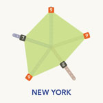
Creating Infographics for the Comparison of Bike Share Programs

by Jihoon Kang, MFA & Luca Nitschke

Suitability of Form for Data: An Analysis of Data Visualization Projects

by Deepika Sahai, Lalit Chaudhari, Sindhu MS, & Sindhu S Rao

KEYWORDS

Instructional diagrams, perspectives, visual communication, visualization, wordless diagrams;

ABSTRACT

The intent of information visualization is to exploit the internal structure of data and its associated relationships to find quick patterns, trends, or events positioned within large data sets, and to help the reader comprehend unseen and often complex relationships. Determining the appropriate visual properties for each element is a constant effort. This paper attempts to depict effective methods to visually communicate information through a set of four well-selected visualizations. One form of visualization is through wordless diagrams, which investigate the appropriateness of a chosen rendering technique, geometry, orientation, grouping, and sequence, and their impact on the recognized meaning and its emotional impact on the readers. A static visualization of data pertaining to the 2013 Delhi assembly elections is attempted in the second visualization. Adding multiple perspectives to depict noise levels in a locality by means of tangible data visualization is explored in the third visualization. An interactive visualization tool is created to facilitate exploration of a time use survey data set having multiple dimensions to quickly draw attention to the key insights from the data. The paper concludes with a discussion on the key takeaways from the iterative design process and set of recommendations for visualization of similar data.

BIOGRAPHY

The authors are currently pursuing Information & Interface Design at National Institute of design, R& D Campus, Bangalore. They have a background in Engineering and significant experience in software industry. As part of their course module, they have worked on various projects in the area of Information Visualization. Their fields of interests are: information visualization, information architecture, and design research.

Representing the Digital Humanities Community: Unveiling The Social Network Visualization of an International Conference

by Dario Rodighiero

KEYWORDS

Actor-network theory, data visualization, interpretant, semiotics, social network visualization

ABSTRACT

This paper deals with the sense of representing both a new domain as Digital Humanities and its community. Based on a case study, where a set of visualizations was used to represent the community attending the international Digital Humanities conference of 2014 in Lausanne, Switzerland, the meaning of representing a community is investigated in the light of the theories of three acknowledged authors, namely Charles Sanders Peirce for his notion of the interpretant, Ludwig Wittgenstein for his insights on the use of language, and finally Bruno Latour for his ideas of representing politics.

There results a proposal to designing and interpreting social network visualizations in a more thoughtful way, while remaining aware of the relation between objects in the real world and their visualizations. As this type of work pertains to a wider scope, we propose bringing a theoretical framework to a young domain such as data visualization.

BIOGRAPHY

Dario Rodighiero is PhD candidate at the Doctoral School of EPFL, attending the Doctoral Program Architecture and Sciences of the Cities. He is employed as designer at the College of Humanities in the DHLAB where his supervisor, Frédéric Kaplan, is director. Previously Dario joined the European Commission and the team of AIME, headed by Bruno Latour, at the médialab of Sciences Po. He created the brand design for the CHI2013 conference in Paris and for the DH2014 conference in Lausanne.

Creating Infographics for the Comparison of Bike Share Programs

by Jihoon Kang, MFA & Luca Nitschke

KEYWORDS

Academic collaboration, data analysis, data visualization, information design, social science

ABSTRACT

The Parsons Institute for Information Mapping (PIIM) and Luca Nitschke, a visiting scholar from Aalborg University, Denmark, conducted a collaborative project in which a series of information graphics were developed regarding conditions of use for available bike-sharing programs. The program was limited to selected cities within the United States. Those who access the results of this effort, presented in the formats of both poster(s) and interactive models, will be able to quickly learn and compare the select programs, analyze causalities of certain conditions, and project how certain problems can be solved. In order to develop these tools the team obtained data across multiple vectors, created standards based on analyzing the data, and created a resultant “scoring system” that could be universally applied. These uniform metrics were then visualized in order to convey the findings and rendered through the poster and interactive formats. This article includes the process of what the team went through to achieve the goals, with a focus on the research methods and design.

BIOGRAPHY

Jihoon Kang is a communication designer and illustrator. He currently serves as Associate Director at the Parsons Institute for Information Mapping (PIIM), The New School, New York. His background experience includes creative and program leadership, project management, information design, Graphical User Interface (GUI) Design, and User Experience Design (UXD). At PIIM, he has worked on projects from the National Geospatial-Intelligence Agency (NGA), Defense Advanced Research Projects Agency (DARPA), US Department of Veterans Affairs (VA), Center for Disease Control and Prevention (CDC), Telemedicine and Advanced Technology Research Center (TATRC), US Navy, United Nations Development Programme, and Macmillan Publishers. He has taught design courses at Parsons The New School For Design. He also serves as a guest lecturer at Icahn School of Medicine at Mount Sinai, New York. He received BFA and MFA from Parsons School of Design, New York.

Luca Nitschke is a researcher interested in bike sharing and its impacts on the urban landscape. He is a master’s candidate at Aalborg University, Denmark in Environmental Studies and visited the Parsons Institute for Information Mapping from November 2014 until January 2015. His current interest lies in the political reasoning behind implementing a bike-sharing system and related struggles regarding the distribution of the urban landscape. He further holds a bachelor’s degree in Environmental Science from Bielefeld University, Germany.